How to Coordinate Home Finishes With Intention
Learn how to coordinate home finishes with a clear palette, disciplined transitions, and room-by-room decisions that give a custom home lasting, quiet calm.
Eternity Builders · September 22, 2026
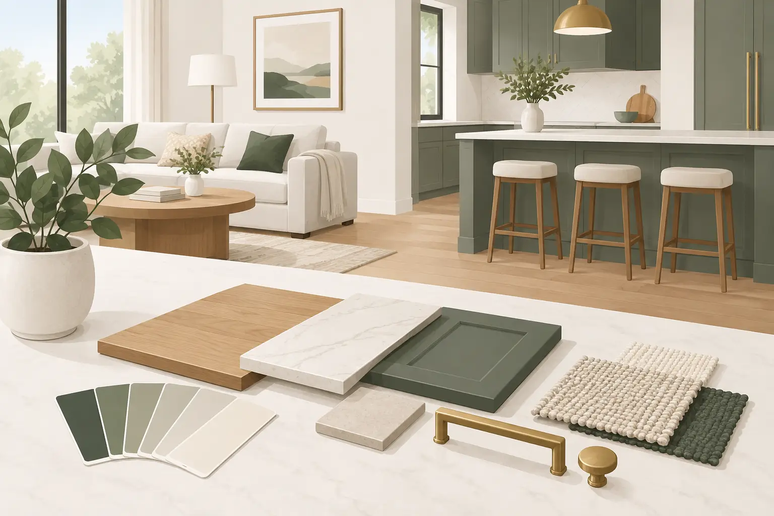
A home can have beautiful stone, tailored cabinetry, exceptional plumbing fixtures, and carefully selected lighting, yet still feel unsettled. The problem is rarely one bad choice. It is usually a series of finishes selected in isolation: a warm floor meeting a cool countertop, a formal fixture competing with casual hardware, or a transition at a doorway that was never resolved on paper. Knowing how to coordinate home finishes means treating every visible material as part of one architectural conversation.
For a custom residence, the goal is not to make every room match. It is to establish a clear visual hierarchy, then allow each space to develop its own character without losing connection to the whole. That discipline is what gives a home the settled quality people feel before they can explain it.
How to Coordinate Home Finishes From the Outside In
Begin with the architecture and setting, not with a single tile sample or a saved image. A limestone-forward Hill Country residence, for example, may call for finishes that acknowledge its weight, texture, and relationship to the land. A more contemporary structure with broad glass openings and crisp rooflines may support cleaner planes, quieter graining, and more restrained contrast.
Exterior stone, roofing, window frames, stucco or siding, and metalwork create the first material language. Interior selections should extend that language rather than start a separate one. This does not mean bringing exterior stone indoors indiscriminately. It means paying attention to shared undertones, scale, and level of formality.
If the exterior uses warm native stone with varied movement, interiors often benefit from materials that ground rather than compete: honed surfaces, wood with a natural grain pattern, aged or brushed metals, and paint colors with a similarly warm undertone. If the exterior is more linear and restrained, the interior can carry that discipline through slab-front cabinetry, cleaner tile layouts, and lighting with deliberate geometry.
The architecture should lead. Finishes are there to clarify it.
Establish a Small Material Vocabulary
The strongest homes usually rely on fewer core materials than clients expect. A disciplined palette is not limiting. It creates room for the materials that matter most to be seen and appreciated.
Before making room-by-room selections, identify the finishes that will appear repeatedly across the residence. These may include the primary flooring, cabinet wood tone, principal metal finish, interior wall color family, stone or countertop family, and trim color. They do not all need to be identical throughout the home, but they should relate clearly.
A useful approach is to assign each material a role. The flooring may be the grounding element. Wood may provide warmth. Stone may carry permanence. Metal may supply contrast and precision. Paint may give the rooms breathing room. When every finish is asked to be the focal point, the result becomes visually busy, especially in open living areas where kitchen, dining, and gathering spaces are all visible at once.
Variation works best when one element stays consistent. A home might carry the same white oak flooring through primary living spaces while changing stone, tile, and cabinet color by room. Or it may maintain one metal family in public areas while allowing a powder bath to introduce a more expressive fixture and wall treatment. Consistency gives the eye a place to rest.
Start With Undertones, Not Names
Terms such as white, gray, beige, bronze, and black are too broad to guide a finished home. Every one of those colors can lean warm, cool, green, pink, yellow, blue, or neutral. Materials that share a color name can still clash when their undertones disagree.
Lay samples together in daylight and under the planned artificial lighting. Look at the full range of each material, not just the most attractive section of a stone slab or wood sample. Natural stone, wood, and handmade tile contain variation by design. The question is whether their variation feels compatible when installed at architectural scale.
This is especially important with white paint, which often changes dramatically beside cream stone, warm oak, or cool polished nickel. A paint color that looks clean in a showroom can appear stark or faintly blue in a finished room. Make decisions in context whenever possible.
Decide Where Contrast Belongs
Contrast gives a home definition. Without it, rooms can feel flat and overly cautious. Too much contrast, however, can fragment the architecture and make every doorway feel like a new design scheme.
Choose a few places where contrast will do meaningful work. A dark island may anchor a light kitchen. A richly veined stone may give the fireplace wall presence. Dark-framed windows may create a strong edge against a lighter interior. These decisions are most effective when the surrounding finishes are quieter.
The scale of contrast matters as much as the color itself. A small black accent can feel precise. A black ceiling, dark cabinetry wall, or dramatically veined floor carries far more visual weight. In a residence intended for decades of family gatherings and daily life, large-scale contrast deserves more consideration than a momentary trend may suggest.
There is also a practical trade-off. High-contrast surfaces can emphasize dust, fingerprints, grout irregularities, and minor wear. That does not make them wrong. It simply means their maintenance profile should suit the way the household actually lives.
Resolve Transitions Before Construction
Some of the most noticeable finish decisions occur at thresholds, corners, edges, and ceiling planes. They are also easy to overlook while selections are still being made as individual samples.
A floor transition should feel intentional at a doorway, not like a correction made after the materials arrived. Tile alignment should be considered against cabinet centers, shower niches, drains, and room entries. Stone thicknesses should be coordinated with cabinet reveals, backsplash returns, and window sills. Trim profiles need to meet wall treatments, tile, and built-ins with purpose.
These details are where finish coordination becomes construction coordination. A beautiful selection schedule cannot compensate for a tile layout that ignores the room geometry or a cabinet installation that does not account for the chosen countertop edge. The best time to solve these relationships is before materials are ordered and trades are on site.
For open-plan homes, draw sightlines through the main spaces. Stand at the entry, kitchen island, dining table, and primary gathering area. What materials are visible from each point? Does a fireplace stone pull attention away from the kitchen? Does a pantry door interrupt a cabinet run? Does the flooring change at a natural boundary? These questions protect the composed feeling of the finished home.
Give Each Room a Reason to Be Different
Coordination is not repetition. Bedrooms, baths, utility rooms, and secondary gathering spaces can carry more individuality because they are experienced at a different pace than the main living areas.
A powder bath is often an appropriate place for a more distinct wallcovering, stone, or sculptural light fixture. A primary bath may introduce a quieter, more restorative material palette. A game room or bar can support deeper tones and stronger texture. The key is to connect these spaces back to the whole through one or two familiar elements, such as the same wood tone, plumbing finish family, or trim detail.
Children's rooms and guest suites deserve the same level of thought, but not necessarily the same permanence as a kitchen or primary bath. Paint, wallpaper, and decorative lighting are relatively adaptable over time. Built-in cabinetry, flooring, and stone are longer-term commitments. Put the most durable investment into the elements that are difficult to change, then use more flexible layers to express personality.
Coordinate the Team, Not Just the Samples
Finish decisions affect more than appearance. They influence lead times, installation sequencing, backing requirements, lighting placement, appliance clearances, and how one trade hands off work to the next. A custom home benefits from a single current selection record that everyone can reference, with approved samples, finish codes, dimensions, locations, and any required mockups.
This record should be reviewed alongside the drawings rather than after them. The architect, interior designer, builder, cabinet team, tile installer, and lighting professionals may each see a different portion of the project. Someone must be responsible for seeing the intersections. Owner-led coordination is valuable precisely because it keeps small finish decisions from becoming expensive field adjustments.
At Eternity Builders, that attention extends to the points clients will notice every day: aligned grout joints, consistent cabinet reveals, intentional stone returns, and fixtures that belong to the room around them. Those details do not announce themselves. They allow the home to feel complete.
A well-coordinated home should not read as a collection of purchases. It should feel like it grew from one set of decisions, made carefully enough to support ordinary mornings, full holiday tables, and the years in between.